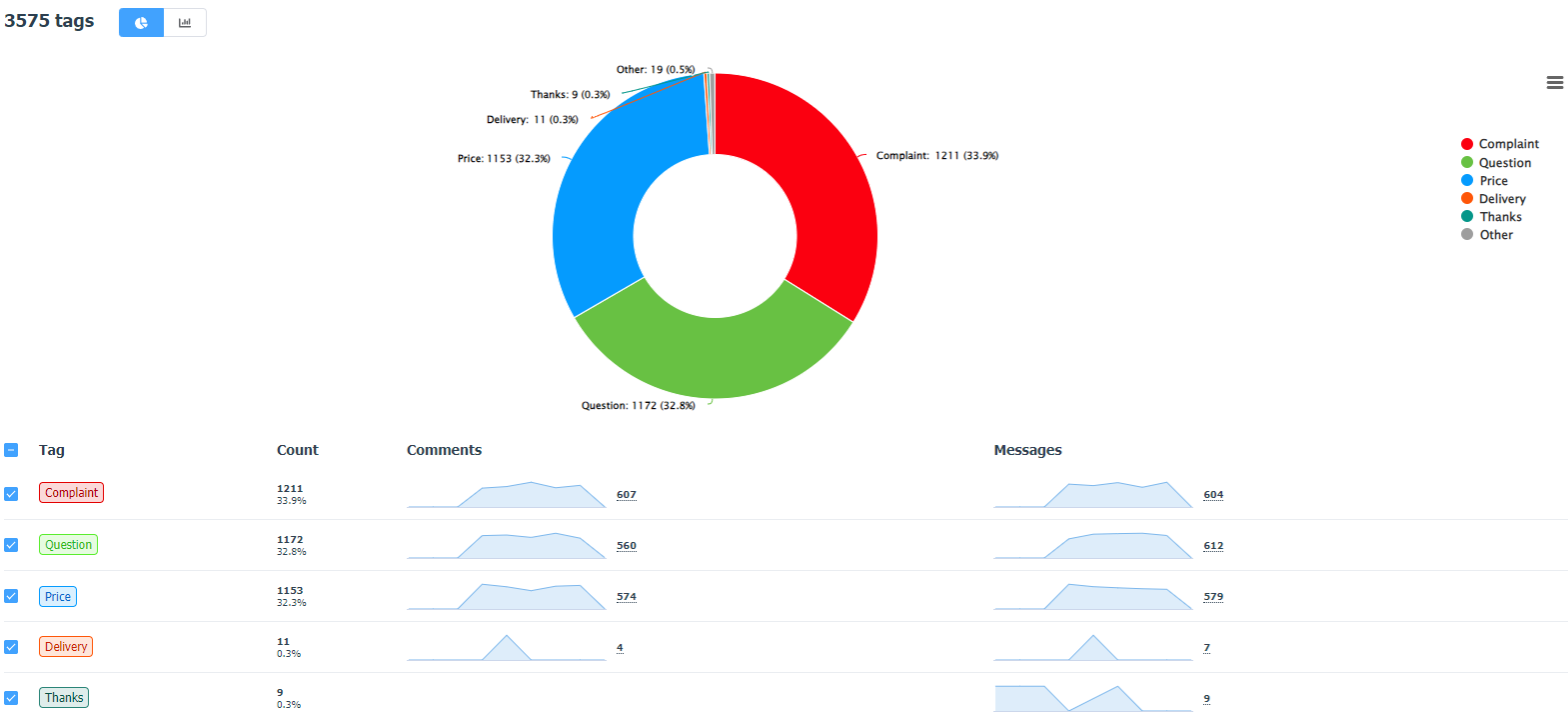
Tag statistics
In the "Tags" tab you can see thetagstatistics in the Direct Messages, Comments and, if you have integration withthe external social listening systems, in the Social listening section.
The data can be displayed as a pie chart:
Either as a graph, with the option to view statistics in numerical or percentage values:
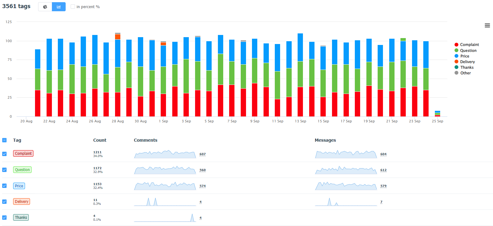
In case of using tag groups (Team plan and above), the data in the statistics will be displayed separately for each group (both in the form of a graph and a chart).
If you need to create a chart for only a part of tags, you can select the necessary tags from the list to display them on the chart by checking the corresponding checkboxes.
You can see the dynamics for each tag below: the graphs will show a spike in the use of a particular tag in comments and direct messages.
To analyze independently, use the export, in which you will see the list of tags, as well as the frequency of use of each tag for different types of appeals and for the period. Please note that the period in the export will be formed automatically depending on the time period you have selected in the filtering block. It could be a day, a week, or a month.